Creating a stylegide with sc5
Hi, developer!
When developing large projects, it is often necessary to create a library of blocks. This allows you to make your project more modular and controllable. Such library can be created using sc5 styleguide. In this lesson, we use sass as a style preprocessor and gulp for automation. SC5 also works great with other technologies, and you can read about it in the documentation.
Installation
Install sc5 using npm in the project folder:
npm install sc5-styleguideFor Windows users, an administrator installation may be required.
Next step, write the dependency in gulpfile.js:
var styleguide = require('sc5-styleguide');Writing gulp task
First, we set the variables in gulpfile.js:
var styleguidePath = 'styleguide';
var overviewPath = assetsDir + 'sass/styleguide.md';
var scssRoot = assetsDir + 'sass/main_global.scss';
Pay attention that you need to create a description of the styleguide in the markdown format and define a variable for it (which we will insert into the task later).
The first task is the generation of the stylegide:
gulp.task('styleguide:generate', function() {
  return gulp.src(assetsDir + 'sass/**/*.scss')
    .pipe(styleguide.generate({
      title: 'Your styleguide title',
      server: true,
      rootPath: styleguidePath,
      overviewPath: overviewPath,
      extraHead: [
        '<style>html {font-size:10px} body {font-size:16px}</style>'
      ]
    }))
    .pipe(gulp.dest(styleguidePath));
});
Here we take all the style files and generate a stylegide based on them. Pay attention to the extraHead parameter - an array, which is then inserted into the <head> tag of the stylegide, is passed to it. In this case, a font size code is inserted to use rem. At this stage, we generate an empty styleguide, as we have not described anything in the styles yet.
The following task is the application of styles inside the stylegide:
gulp.task('styleguide:applystyles', function() {
  return gulp.src(scssRoot)
    .pipe(sass({
      errLogToConsole: true
    }))
    .pipe(styleguide.applyStyles())
    .pipe(gulp.dest(styleguidePath));
});
The variable scssRoot was defined before that.
If you want to use any project files inside the stylegide, you can transfer them. In order not to do it every time I manually wrote a task:
gulp.task('styleguide:copyFonts', function () {
  return gulp.src('')
    .pipe(plumber())
    .pipe(dirSync(assetsDir + 'fonts/', styleguidePath + '/fonts/', {printSummary: true}))
    .pipe(browserSync.stream());
});
The gulp-directory-sync plugin is used to synchronize the folders.
Next, we collect the gulp tasks into one and send it to default and watcher:
gulp.task('styleguide', ['styleguide:generate', 'styleguide:applystyles','styleguide:copyFonts']);

gulp.task('default', ['otherTasks','styleguide']);

gulp.task('watch', function () {
  gulp.watch(assetsDir + 'sass/**/*.scss', ['sass','styleguide']);
});
Documenting the style code
We need to write comments in styles using kss in order to make the style guide to “come to life”. The kss syntax is described in details on their website. It looks like this:
// Name of the component
//
// Description of the component
//
// markup:
//<div class="block">Layout for component</div>
//
// Styleguide 1.1(component number)

.block {
  display:block;
}
Давайте напишем тестовую страничку для кнопок стайлгайда. Создаем отдельный файл _buttons.scss и внутри него описываем кнопки. Для описания кнопок используется @extend(более подробно система с кнопками изложена в статье на нашем блоге)
_buttons.scss:
Let’s write a test page for the styleguide buttons. Create a separate _buttons.scss file and describe the buttons inside it. For the description of the buttons, use @extend (for more details about the system with the buttons you can look in an article on our blog)
_buttons.scss:
//common styles for buttons
@mixin button() {
display: inline-block;
text-decoration: none;
text-align: center;
font-family:sans-serif;
&:hover, &:focus {
text-decoration: none;
}
}
// color types
%button_default {
color:$white;
background: $brand_default_color;
transition:.3s ease;
&:hover {
background:darken($brand_default_color,5%);
}
}
%button_success {
color:$white;
background: $brand_success_color;
transition:.3s ease;
&:hover {
background:darken($brand_success_color,5%);
}
}
%button_danger {
color:$white;
background: $brand_danger_color;
transition:.3s ease;
&:hover {
background:darken($brand_danger_color,5%);
}
}
// size types
%button_big {
height: 5rem;
padding:0 3rem;
line-height: 5rem;
font-size: 2rem;
border-radius:8px;
@include button();
}
%button_standart {
height: 3.6rem;
padding:0 2rem;
font-size: 1.6rem;
line-height: 3.6rem;
border-radius: 6px;
@include button();
}
%button_small {
height: 2.4rem;
padding:0 1rem;
font-size: 1.3rem;
line-height: 2.4rem;
border-radius: 4px;
@include button();
}
// Buttons
//
// All project buttons
//
// Styleguide 1.0
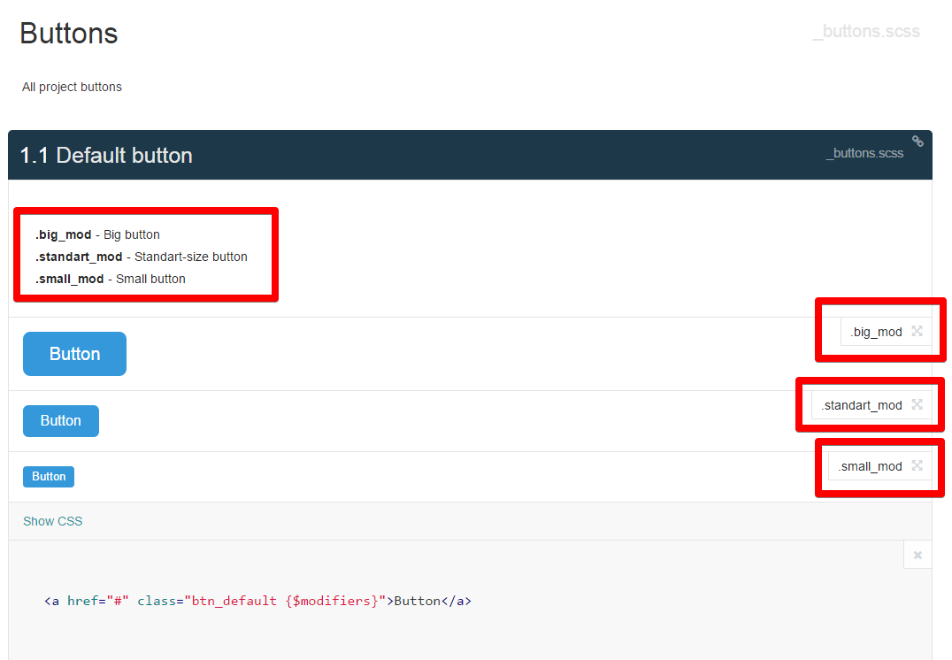
// Default button
//
// .big_mod - Big button
// .standart_mod - Standart-size button
// .small_mod - Small button
//
// markup:
//<a href="#" class="btn_default {$modifiers}">Button</a>
//
// Styleguide 1.1
.btn_default {
@extend %button_default;
&.big_mod {
@extend %button_big;
}
&.standart_mod {
@extend %button_standart;
}
&.small_mod {
@extend %button_small;
}
}
// Success button
//
// .big_mod - Big button
// .standart_mod - Standart-size button
// .small_mod - Small button
//
// markup:
//<a href="#" class="btn_success {$modifiers}">Button</a>
//
// Styleguide 1.2
.btn_success {
@extend %button_success;
&.big_mod {
@extend %button_big;
}
&.standart_mod {
@extend %button_standart;
}
&.small_mod {
@extend %button_small;
}
}
// Danger button
//
// .big_mod - Big button
// .standart_mod - Standart-size button
// .small_mod - Small button
//
// markup:
//<a href="#" class="btn_danger {$modifiers}">Button</a>
//
// Styleguide 1.3
.btn_danger {
@extend %button_danger;
&.big_mod {
@extend %button_big;
}
&.standart_mod {
@extend %button_standart;
}
&.small_mod {
@extend %button_small;
}
}Note that we can describe block modifiers (for example .big_mod), and then put the {$modifiers} parameter. Stylegide will generate all kinds of buttons for us.
If you want to create another section with blocks - just make a new scss-file (for better clarity) and write new blocks in it, indicating the corresponding numbers for them
If you want to insert some blocks together – it’s not necessary to rewrite the markup, you can just insert them by numbers through a special
// Page header
//
// Main header of the page
//
// markup:
//<header>
//<sg-insert>2.3</sg-insert>
//<sg-insert>2.1</sg-insert>
//</header>
//
// Styleguide 3.0
If the styleguide is not generated
Sometimes happens that sc5, without giving out any error, simply does not generate a styleguide. In this case, try to wrap specific preprocessing styles into special comments:
// styleguide:ignore:start
@function z-index($key) {
  @return map-get($z-index, $key);
}

@mixin z-index($key) {
  z-index: z-index($key);
}

@mixin font_face($file_name,$font_name:$file_name,$path:$font_path,$weight:normal,$style:normal) {
  @font-face {
    font-family:quote($font_name);
    src: url($path + $file-name + '.eot');
    src: url($path + $file-name + '.eot?#iefix') format('embedded-opentype'),
    url($path + $file-name + '.woff') format('woff'),
    url($path + $file-name + '.ttf') format('truetype'),
    url($path + $file-name + '.svg##{$font_name}') format('svg');
    font-weight: $weight;
    font-style: $style;
  }
}
// styleguide:ignore:end
//
Conclusion
Development through the styleguide helps the interaction between the designer and the layout designer. You get a page with independent blocks, and by connecting regression tests, you can quickly catch layout errors. Your site (or application) is now much easier to scale, and the lifelenght from one project is easily transferred to others.
That’s all.