Spotify. Work with sections
First of all we need to understand what “sections” were embedded for, what exactly they give to the theme developers and to the owners of the stores. The functional of the sections was inculcated by the developers of Shopify at the end of 2016 and it gives an opportunity to create the user interface that allows the store administrator easily add or change the order of displayed content, whether it is simple text sections or complex sliders and galleries.
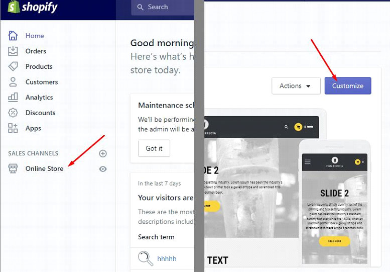
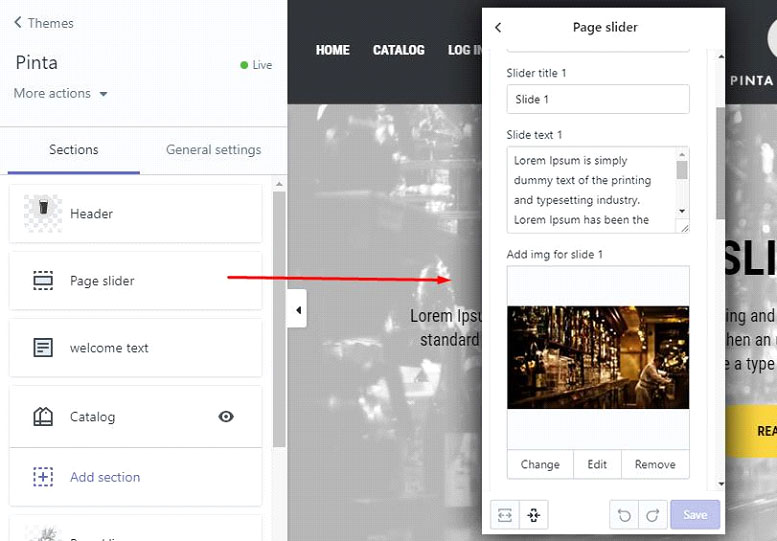
The administrator sees all the changes in real-time and it is very comfortable. The management is available from the administrative part of the store (watch pic. 1 and 2).
 pic. 1
 pic. 2
Sections can be switched on statically (for example header or footer template), also you can dynamically add or delete them via the administrator interface on the main page of the theme. In the above example, you can see editing of the content of the static section on the slider example. Also, there is a noticeable button “To add a section”, that allows to display dynamic sections. We will speak about all of this in this article.
The templates of the sections are located in the folder sections and are simillary displayed to snippets. If the section file is in sections/sponsored.liquid, we display it in the next way.
{% section “sponsored” %}Notice: you don’t need to point name suffix .liquid as you do in the themes of snippets.
Let’s look at the real example to understand the possibilities of sections. Below is the content of the file sections/footer.liquid
<h1>{{ section.settings.title }}</h1>
<p>{{ section.settings.description }}</p>
{% schema %}
	{
		"name": "Footer",
		"settings": [
			{
				"id": "title",
				"type": "text",
				"label": "Footer Title",
				"default": "title"
			},
			{
				"id": "description",
				"type": "richtext",
				"label": "Add your description below",
				"default": "<p>Add your description here</p>"
			}
		]
	}
{% endschema %}
As you see this file contains a mix of HTML, Liquid placeholders and JSON, which is similar to the theme configuration file settings_schema.json. The functional settings_schema.json remains, the sections simply add additional information.
There is HTML at the top of the template, which will be displayed on the page. Inside of each element h1 and p there are Liquid placeholders that use such syntax:
{{ section.settings. [X] }}In our example, the section template will output data that matches:
{{ section.settings.title }}
{{ section.settings.description }}
On the one hand, everything is perfect, but on the other hand, how Shopify knows what exactly to display in these placeholders? That’s what we need to show in JSON, which is located between the opening and closing tags:
{% schema %}To output the section in the area of the store “theme settings”, you need to assign the indicator to it, defining the value “name” at the top-level of our JSON.
Next comes the configuration level, which contains two sub-notes, where are properties “id”, “type”, “label”, and “default”. Each of them, depending on the value, determines the display method of the administrator interface.
id
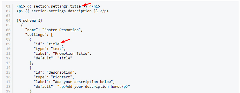
An identifying code that indicates that exactly from this sub-note we need to display information in the corresponding placeholder (watch pic. 5).
 Pic. 5
Despite the fact that the identifiers in the section file must be unique, their uniqueness in all section files is not necessary. That’s why it’s absolutely normal to have “id”: “title” in the files of several sections. Also, the section settings won’t conflict with the settings in settings_schema.json.
type
Indicates the type of control that will be displayed in the administrator chapter. List of frequently used parameters:
text:single-line text fieldtextarea:multiline text fieldrichtext:text field with the features of text editorimage_picker:upload imagesradio:radio buttonsselect:drop-down listcheckbox:checkboxesrange:the range or value slider
Some of the types additionally require JSON for work. For example, drop-down lists or radio buttons. Detailed information you can find on the page with official documentation.
label
Displays the title of the control that is displayed in the administration chapter.
default
Adds the value in the control placeholder. We should say that this value will be used until the section won’t be updated by the store administrator.
Also, there are types to output url addresses, custom HTML, and e.t.c. You can read about them by clicking https://help.shopify.com/themes/development/theme-editor/settings-schema.
Besides, using special tags you can add custom JS and CSS in section files:
{% stylesheet %}{% javascript %}<div class="slideshow" id="slideshow-{{ section.id }}"></div>
<style>
#slideshow-{{ section.id }} { … }
</style>
{% javascript %}
$('.slideshow').slideshow();
{% endjavascript %}
{% stylesheet %}
.slideshow {
/* default styles */
}
{% endstylesheet %}And what about the fineness of the code? It means that we will have a huge amount of scattered inline files css и js. But we have good news. Shopify packs all CSS and JS in one file, which leads via placeholder Liquid content_for_header. Also, you have an opportunity of using SASS when writing custom styles, you can do this with tag:
{% stylesheet 'scss' %}If you look at the section output on the page, you will notice that it is wrapped by the element <div> with the unique identifier and class shopify-section.
<div id="shopify-section-footer" class="shopify-section">You can add the custom class to this element using utility “class” in your JSON.
{% schema %}
	{
		"name": "Slideshow",
		"class": "slideshow"
	}
{% endschema %}
<div id="shopify-section-[id]" class="shopify-section slideshow">
[output of the section template]
</div>As the result, the sections are a powerful tool for developing Shopify themes and their further administration.